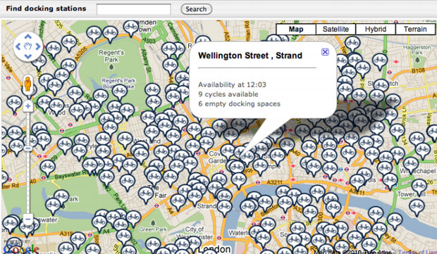
It may look like the kind of visuals you’ll be enjoying when you’re deep in a ketamine hole, but the fabulously psychedelic animation below actually shows a summary of five million bicycle journeys made in 2010-11 in central London.

The origins and destinations of each journey were recorded and animated along a curved trajectory, with the animation showing the effect of changing the length of the ‘trail’ left by each journey (this starts to increase from 15 seconds into the animation).
Created by Jo Wood, Aiden Slingsby and Jason Dykes at the City University, the animation plots the journeys taken on of the Barclays Cycle Hire scheme, with the routes being extrapolated from the time and location of bikes taken out and returned to a docking station.

The video animation analysis is explained here:
By changing the prominence given to more common journeys (from 45 seconds onwards), structure emerges from the apparent chaos of journeys. Three major systems become apparent (from 1 minute onwards) – Hyde park to the west, commuting to/from King’s Cross St Pancras to the north and Waterloo to/from the City to the east.
“The video-graphic shows that by changing aspects of the visual design, we can bring out the structure in movement patterns that might otherwise be hidden by the chaos of millions of journeys,” added Jo Wood.
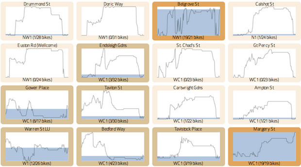
Apart from looking wonderfully trippy, this visualisation offers insights on where to build new bike docking stations, the amount of bikes needed to be stocked and where the bikes are most needed at different times of the day.
You can find our more in paper they’ve posted [PDF file].


