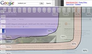
 Fresh out of Google Labs is their new Browser Size tool, which lets web developers see what parts of their pages users can see without scrolling.
Sporting a funky DIY graphic interface, it lets designers input their own URL and have the browser size stats overlaid on top of their page.
Here’s how Google describe their new widget thingamabob:
Google Browser Size is a visualization of browser window sizes for people who visit Google. For example, the “90%” contour means that 90% of people visiting Google have their browser window open to at least this size or larger.
This is useful for ensuring that important parts of a page’s user interface are visible by a wide audience. On the example page that you see when you first visit this site, there is a “donate now” button which falls within the 80% contour, meaning that 20% of users cannot see this button when they first visit the page. 20% is a significant number; knowing this fact would encourage the designer to move the button much higher in the page so it can be seen without scrolling.
To view your own Web site with this same visualization overlaid on it, simply type its URL into the “Enter URL here” textbox at the top of the window and click Go.
Notes:
- You can change the opacity of the overlay by clicking the gray boxes next to the word “Opacity” at the top of the window.
- As you move the mouse around the window, you will see a transparent rectangle following the mouse pointer. This feature allows you to interact normally with the page you’re examining even though it has a graphical overlay atop it.
- The sizes represented in this contour are client area sizes, not browser window sizes. This means they represent the size of the browser without the title bar, toolbars, status bars, etc., and thus give a true representation of how much content can be seen by a particular segment of the Web-using population.
- Browser Size works best on web pages with a fixed layout aligned to the left. If the content reflows as the width is adjusted or it is centered, then the results can be misleading. In this case, you can obtain more accurate results by reducing the browser width to a percentage column, e.g. 90% and seeing what content falls below the 90% horizontal line.
We’re actively looking to develop and improve the tool. So if you have comments or suggestions, please feel free to contact us at [email protected].
Check it out here: Browser Size