We’ll be honest, when we think of award-winning great design, the ultra-minimal UK government site gov.uk isn’t the kind of thing that springs immediately to mind.
But there’s much more to this site than just its no-nonsense simplicity and unfussy design.
Named the 2013 Best Design of the Year by the Design Museum in London last night, the site beat 99 short-listed buildings, inventions and cars and is the first website to ever win the title in the six years the award has been running.
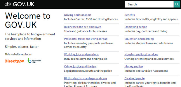
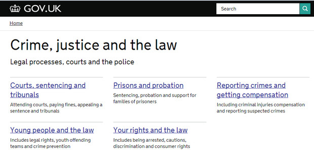
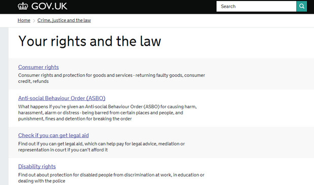
What makes the website so brilliant is the way it has managed to provide a unified and easy-t0-navigate interface for the hundreds of different government websites contained under its umbrella.
There’s only one typeface used throughout on Gov.uk, there’s few images on offer and you can forget about social networking gubbins all over the page too.
This is a site about getting things done quickly and easily rather than trying to impress readers with flashy design or funky interfaces and the design matches its functionality perfectly.
“You shouldn’t come to the website and say ‘wow, look at the graphic design!,'” said Ben Terrett, head of design at the UK’s Government Digital Service. “You should come to the website to find out what the minimum wage is.”
“There were thousands of websites, and we folded them into Gov.uk to make just one,” he added. ” Booking a prison stay should be as easy as booking a driver’s license test.”
Find out more about the design philosophy in this video below.
Read more here: “We’re trying to get design out of the way”