It’s long been one of the ugliest interfaces we’ve had to look at every day, but Google have finally despatched a designer in the direction of their Google Contacts web app and said, “Sort it out, FFS!”.
It’s not fully released yet, but the Google Contacts preview is already about a billion times better than the pug-ugly beast they went before it.
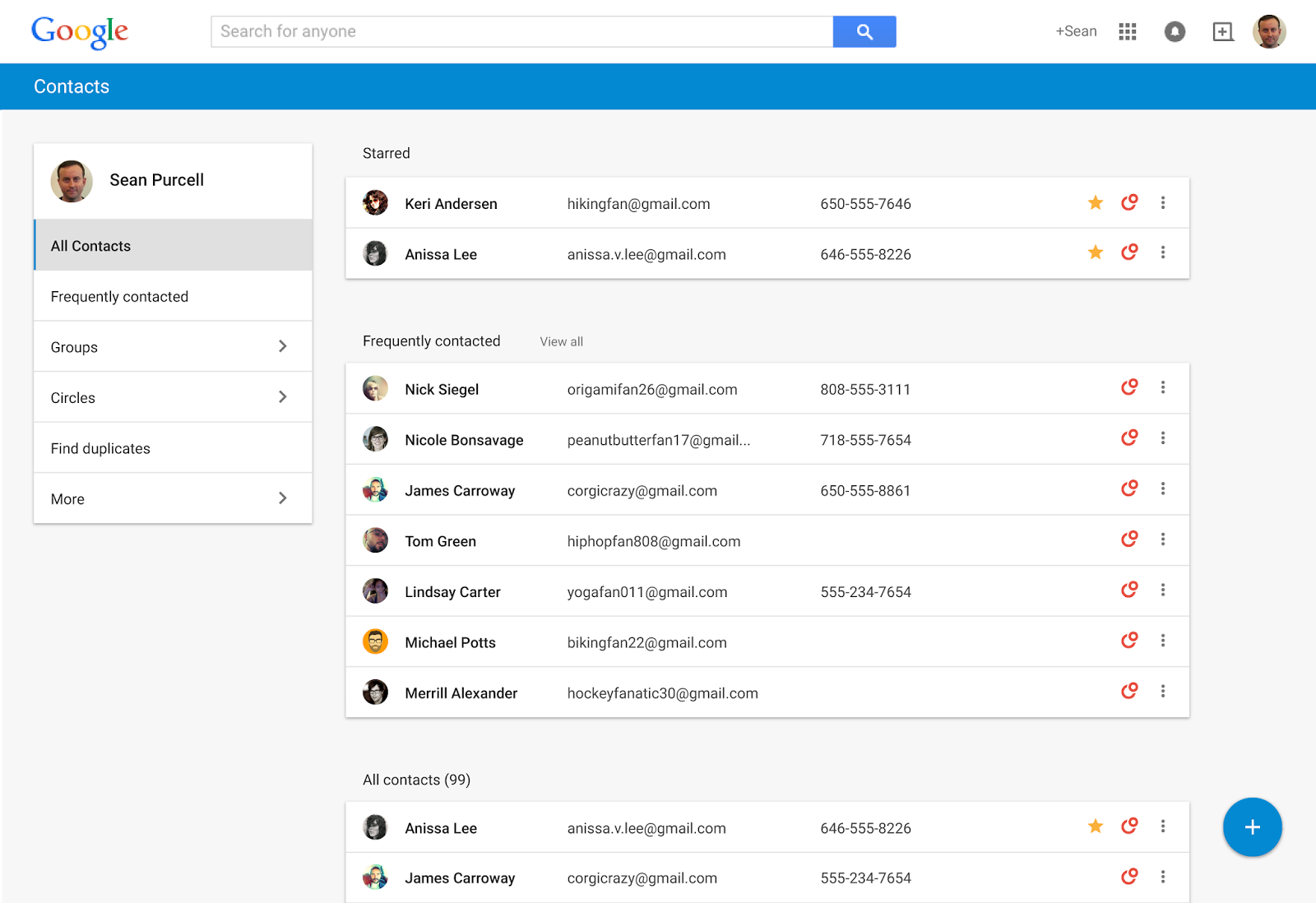
The crisp new interface serves up a pleasantly fresh look and feel, and conveniently pools together all your contacts, Google + circles (if you have any), and the people you talk to most in Gmail.
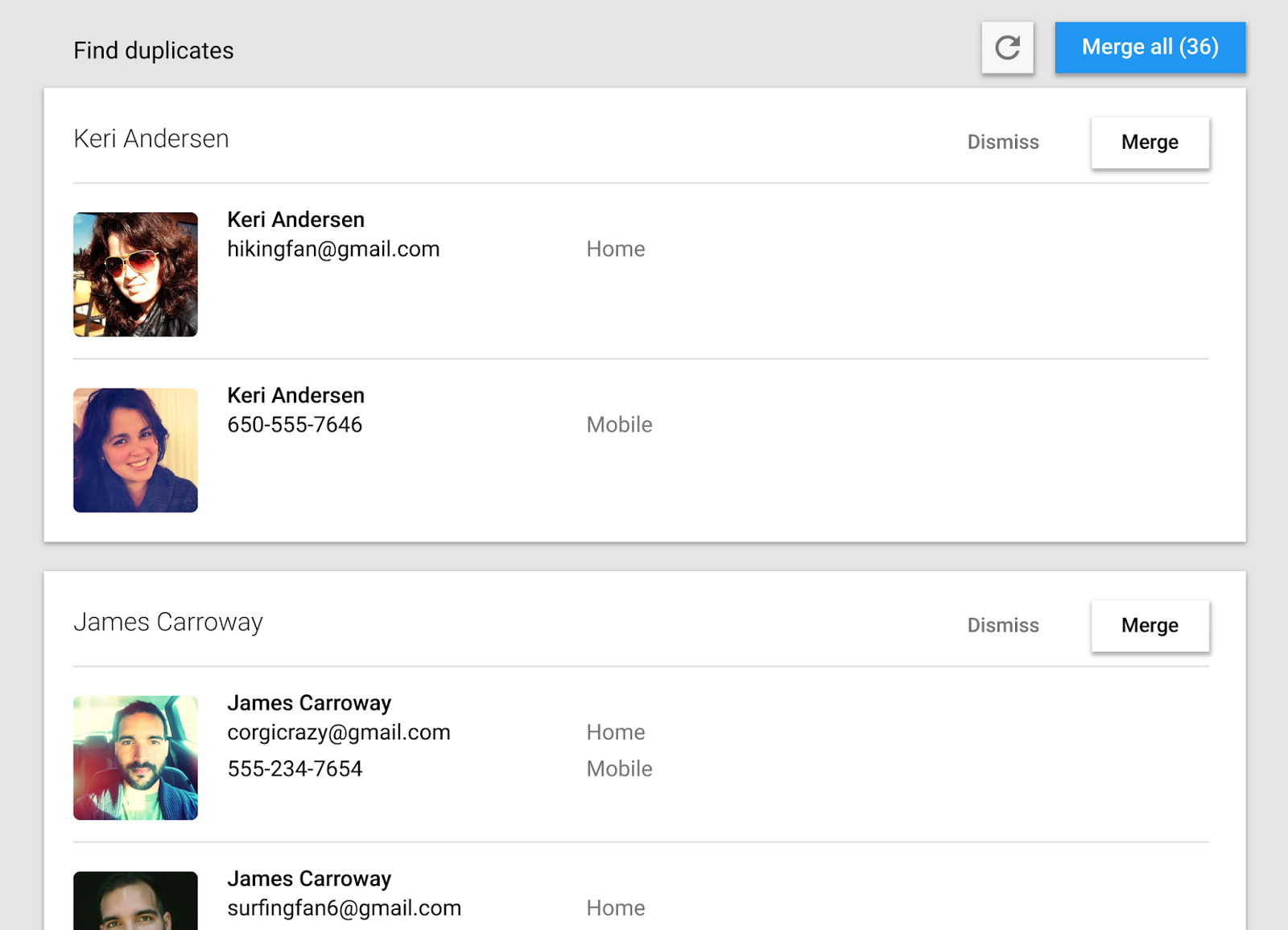
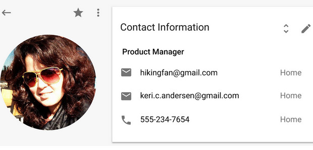
To keep the info up to date, the new Contacts app also blends your contact’s Google profile information with the stuff you already have. Neat.
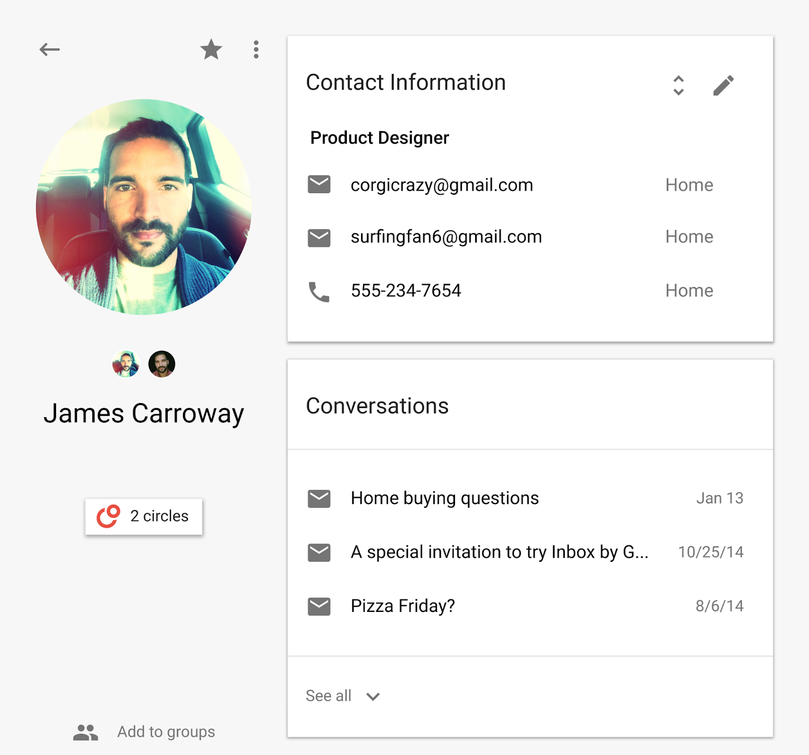
We also like the fact that a contact card displays the most recent emails and meetings with a person, so you can see if it’s been two days or two years since your last conversation.
You can’t access the preview through Gmail at the moment, but you can bathe in its user-friendlyness by visiting contacts.google.com/preview.
[Google]