
This fascinating map tracking Facebook relationships has been put together by Paul Butler, an intern on Facebook’s spoddy sounding ‘data infrastructure engineering team’ (we bet they’re a heap of fun on a night out).
Sampling around ten million pairs of friends, the stat-scooping Butler combined the data with each user’s current city and added the number of friends between each pair of cities and merged the data with the longitude and latitude of each city.
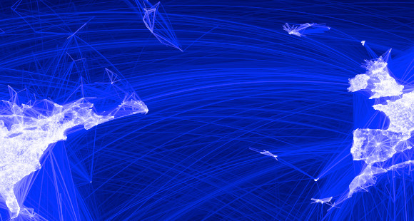
In the resulting rather pretty image, the white lights represent cities, towns, and hamlets, with the blue streaks being the relationships linking them.
Notably, huge chunks of Australia and South America appear barely touched by Facebook activity, but the biggest omission is the dark areas where Russia and China should be, which have so far escaped the data mining clutches of Facebook.

[Click on image above for larger image]
Here’s Butler explaining his methods and findings:
I defined weights for each pair of cities as a function of the Euclidean distance between them and the number of friends between them. Then I plotted lines between the pairs by weight, so that pairs of cities with the most friendships between them were drawn on top of the others. I used a color ramp from black to blue to white, with each line’s color depending on its weight. I also transformed some of the lines to wrap around the image, rather than spanning more than halfway around the world.
After a few minutes of rendering, the new plot appeared, and I was a bit taken aback by what I saw. The blob had turned into a surprisingly detailed map of the world. Not only were continents visible, certain international borders were apparent as well. What really struck me, though, was knowing that the lines didn’t represent coasts or rivers or political borders, but real human relationships. Each line might represent a friendship made while travelling, a family member abroad, or an old college friend pulled away by the various forces of life.
Later I replaced the lines with great circle arcs, which are the shortest routes between two points on the Earth. Because the Earth is a sphere, these are often not straight lines on the projection.
When I shared the image with others within Facebook, it resonated with many people. It’s not just a pretty picture, it’s a reaffirmation of the impact we have in connecting people, even across oceans and borders.

Is Facebook banned in Russia? It is a surprising omission, to say the least.